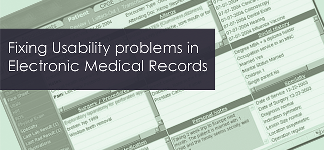
Over the past 2-3 years, most health care providers in the U.S. have completed the transition to Electronic Medical Records (EMR). Ultimately, the adoption of EMR is meant to make health care more efficient and less expensive while improving a patient’s quality of care by making their medical history readily available to all of their healthcare providers.
As users in the field are gaining experience with EMR, however, usability problems have emerged that are a result of the User Interaction design of some of the many EMR software packages that are currently in use. The designers and UI engineers developing EMR software need to address some of these problems in order to make EMR more effective and to reduce the likelihood of dangerous mistakes. The following common usability problems exist today:
1. Patient Identification Errors
Patient identifiers (e.g., EMR Number; patient name; date of birth) are not clearly displayed or selectable onscreen, resulting in treatment actions with potentially harmful consequences performed for one patient that were intended for another patient. (1)
Information is displayed in a confusing format, which can lead to a patient’s receiving the wrong medication. Data related to medication is displayed in a manner that makes it easy to miss. For example, a physician prescribes a medication containing sulfate to a patient with a sulfate allergy because allergy information within the EMR is not clearly emphasized or is difficult to locate on the page. (1)
2. Delay in Treatment Events
Poor EMR page design leads to a delay in critical patient care activities. For example, a patient’s surgery is delayed because an alert about an abnormal lab test result was not displayed clearly and in a manner designed to signify its importance. (1)
Clinicians perform critical tasks, or steps in a task, out of order. For example, a patient with a fever may have a blood culture performed, followed by intravenous antibiotics. If antibiotics are given prior to the blood culture, the sensitivity of the culture decreases dramatically. EMRs that support providers in the order of events are more likely to reduce order errors. (1)
3. Use of Technical Jargon
Based on several interviews with physicians who are currently working with EMRs, we discovered that onscreen lab reports often contain technical jargon that may be not be familiar to all healthcare providers, prompting the user to look up a term online. Most current EMR reports do not have an embedded appendix or glossary of terms.
4. Lack of Readability
Developers often base their EMR design on alphanumeric data fields rather than on compelling and easy-to-scan visual elements like charts, graphs, and color schemes that can be helpful to users who must quickly read and process information displayed onscreen. For example, if the report contains an abnormal score, it should be clearly displayed using alerting colors and contrasting type styles, to capture the physician’s attention. (4)
5. Inconsistent Formats
Because each hospital or practice may use a different vendor’s EMR, doctors can often encounter several different EMRs during the course of a work day, each of which uses a different format for displaying information. This lack of consistency can make it difficult for physicians to find information quickly.
In order to make EMRs easier to use and reduce the patient treatment errors that result from flawed information design, we offer a few ideas for UI design:Interactive Graphical Treatment Timelines
By incorporating interactive graphical treatment timelines that track the cause-and-effect details of a patient’s healthcare process, the health care provider is able to quickly see the patient’s pathology and treatment history in a way that is useful and intuitive. (2,5)
Effective Use of Color
Use a color system to differentiate data points and make it easier for the user to visually map fields and values. For example, if a patient’s white blood cell count comes back as trending lower, it could be indicated in red. (6)
Group Data Fields Where Appropriate
Information should be placed onscreen near other data with which it is often viewed. For example, a patient’s blood pressure report should be placed near the lipids (cholesterol) report as they are often linked and reviewed in the context of the patient’s overall cardiovascular health. (4,5,6)
Help and Reference Documentation
Incorporate a Help section and reference appendices into the EMR screens so that the user can find them quickly and access them easily. (6)
References
- B. Shneiderman, "Tragic Errors: Usability and Electronic Health Records," Feature, Nov. and Dec. 2011.
- L. Lins, M. Heibrun, C. Silva, "VISCARETRAILS: Visualizing Trails in the Electronic Health Record with Timed Word Trees, a Pancreas Cancer Use Case," Workshop on Visual Analytics in Healthcare, pp. 13-16, 2011.
- C.B. Teston, "Investigating Usability and ‘Meaningful Use’ of Electronic Medical Records," Sigdoc, pp. 227-232, Oct. 2012.
- K. Wongsuphaswat, D. Gotz, "Outflow: Visualizing Patient Flow by Symptoms and Outcome," pp. 25-27, Aug, 2011.
- Z. Zhang, F. Ahmed, A.Mittal, "AnameVis: A Framework for the Visualization of Patient History and Medical Diagnostics Chains," Visual Analytics in Healthcare, pp. 17-20, 2011.
- R. Pereira, J. Duarte, M. Salazar, "Usability Evaluation of Electronic Health Record," Int. Conf. Biomedical Eng. Sciences, pp. 361-364, Dec. 2012.
