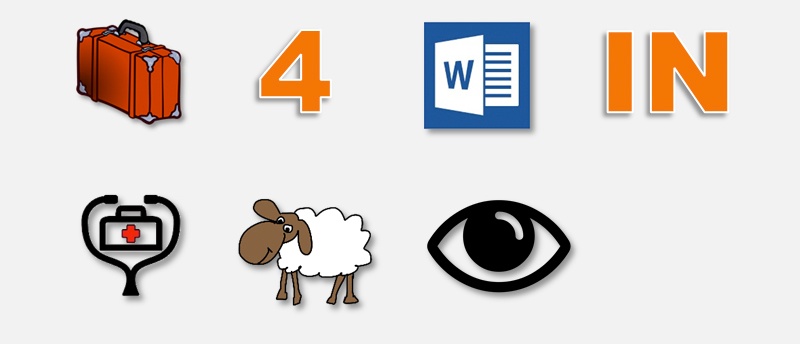
"A word is worth a thousand pictures” – Bruce Tognazzini
While it is possible to communicate using only pictures (just ask the ancient Egyptians) it is almost always better to use words as well. You might have been able to parse the picture above, but it was undoubtedly easier to read the words in the title of this article.
A request we often hear when beginning a graphical user interface (UI) project is to minimize (or even eliminate) on-screen text. Project teams think that icons will make the medical device easier to use, and/or that text is too difficult to translate. While including properly tested icons and other graphics can aid usability and make a UI more appealing, relying on them exclusively can actually make medical products harder to learn and use.
Here’s why you should use words in your medical device UI, and some tips on how to make internationalization (I18N) easier for your team:
Enhanced Usability
As the Nielsen-Norman group writes, there are only a few icons that users will instantly recognize, and these are for simple concepts like “home” and “search”. Trying to represent more complex concepts such as those found in the medical world will lead to confusion unless the icon is accompanied by text. What’s a good icon for “analyze”? For “therapy”? A good rule to follow is that if it takes you more than 5 seconds to think of an icon to represent something, it’s unlikely to be understood by a majority of your users.
Even if it’s easy to determine what an icon is (a heart) it might be difficult to figure out what the icon means in the context of use (is it related to “favorites”? “cardiac function”?)
Compliance with Regulations and Guidelines
In the United States, one of the factors the Food and Drug Administration considers when evaluating applications to market medical devices is adherence to design guidelines such as AAMI HE:75 Human factors engineering – Design of medical devices. This document’s advice for medical product designers includes:
- Use symbols only if 85% of intended users recognize its meaning in a specific clinical setting (section 10.4.3).
- Never use illustrations and graphics instead of text for instructions. Only use graphics to help users understand the text (section 11.2.3.11).
- Include text labels with icons wherever they are used (section 11.2.3.11).
- Use graphics and white space to enhance understanding and make the device look less intimidating (section 21.4.7).
All of that being said, the inclusion of graphics and icons can have benefits, including:
- Faster control recognition
- Larger and more uniform targets make it easier to tap or click
- Lower information density provides a less intimidating appearance
- Illustrate concepts that are hard to describe in words
- Users can more quickly interpret proportions and trends communicated with graphics than with numbers
- Visual appeal
The takeaway is that you can and should use icons and graphics where it makes sense but you have to back them up with text to assure usability.
Using Your Words
A user interface is a conversation between your product and users about what users want to accomplish and how the product will help the user make that happen. It’s vital that both parties are clearly understood. The words you choose for your interface matter, so always be thinking of the person who will be reading those words. What do they need to know at each step? How can you explain it briefly and clearly?
Once you have the right words, you will need to translate them for use in different countries. For many types of medical products, you will be required to translate the instructions for use and other training materials for each locale. If you set things up properly in your software you can leverage this work for the UI text as well.
It starts with the user interface design and layout. Different languages will require different amounts of room to express the same thought. Here’s an example from AAMI HE:75 (table 21.4):

Languages can also vary in other ways, including:
- Sentence structure – adjectives come first in English, second in Spanish and other languages (see “pure oxygen” above).
- Use of gender – English is neutral, while Spanish and other languages use masculine/feminine nouns and articles.
- Reading direction – English and other Western languages read left to right, while Hebrew, Arabic, and others read right to left. Happily, languages like Chinese that were historically written vertically have evolved toward horizontal orientation, especially in the computer age.
All of this impacts developing your software code, but don’t despair. Following the tips below will help you smoothly internationalize your product and also benefit your English versions (cleaner designs, easier to update labels, etc.)
- Choose frameworks and fonts that support string extraction and international character sets.
- Extract text like button labels and error messages from your code base. This makes it easier for your software to switch languages on the fly and provides a ready-made work list for your translation provider. Don’t include text in your graphics either.
- Keep text brief and clear to start with. Watch out for idioms that won’t translate.
- Leave room for text expansion. Languages like German and French might need 25% or more additional space, but it’s best to look at the specific words and languages in your product. Methods like flexible layouts and placing labels on top of data fields (instead of beside them) can help.
- Do a test run on your mockups with a machine translation service like Google Translate so you can find design issues before coding. Always have a native-speaking subject matter expert check the final text.
- Start early and do your homework. Careful planning and early testing will help avoid problems when you’re ready to launch. Articles from Intel, PhraseApp, and product engineering blog Zühlke are a good start for more in-depth tips.
