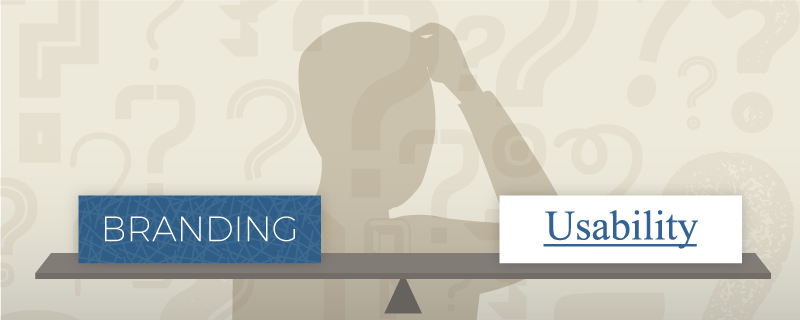
Branding versus usability… the responsibility falls on the designer to determine the balance in medical device user interface design. Designers struggle to uphold the spirit of the brand when pursing usability and often fear that the use of branding can reduce successful task completion. We tend to overlook that it’s both branding and usability that shape the user’s opinion and feelings of success when using a product. To help achieve this harmony in a UI design, here are some tips and suggestions to keep in mind.
What is branding?
Let’s define what we mean by brand and branding. The brand is not the logo or the color palette; it’s the promise of what a company stands for or the value it offers its customers. For example, a brand could represent the promise that its products are accurate, durable, and safe. Branding is an expression of the brand’s identity through the application of the brand’s guidelines to the user interface. Branding is not simply adding the logo to the interface, but rather considering how the brand’s identity can be reflected in all aspects of the interface, including informational components, input controls, and navigation.
In UI design, we’re aiming to deliver on the brand through the application of branding to the user interface.
How is brand expressed through the user interface?
UI design patterns have become a popular tool for solving common design problems because they add an element of familiarity to an interface. Users feel comfortable using patterns they recognize; they identify a text box with a magnifying glass icon as a mechanism for performing a search, and they know that pressing a button-shaped element will initiate an action. Though UI design patterns tend to be familiar to users, they may limit options for the designer and could lead to an interface that feels generic and lacks identity.
This is where branding comes in. The judicious application of branding to an interface can elevate the experience to a unique and memorable level far beyond that of standard design patterns. Here are a few areas to consider when incorporating branding into an interface.
Microinteractions
Microinteractions are contained single tasks that result in some form of feedback, such as changing a setting, picking a password, or refreshing a screen. They are everywhere in interface design, and while small and subtle, they can make the difference between a product that is used and a product that is loved. A clever and well-designed animation in a microinteraction gives users a moment to dynamically experience your brand and leaves them with an emotional impression. Think about how brand can be incorporated into microinteractions that give immediate user feedback, help users navigate, or encourage interaction.

Gmail’s pull-to-refresh microinteraction uses Google colors and subtle animation to add a bit of playfulness to an otherwise mundane task.
Color
Color plays dual roles in user interface design. It can serve a functional role, such as calling out important information. It can also serve an aesthetic role in expressing the brand’s identity and boosting appeal, such as in a page background color. The challenge is to find ways to use branding colors to serve both purposes without competing.
When considering color in a UI design, examine the brand’s color palettes, and think about the significance of the colors to the brand and how the colors might be applied to improve flow and hierarchy or indicate status. Color can be used in its aesthetic role on the outer wrapper, or chrome, of the user interface to express the brand’s identity. For the data-dominant inner areas of the user interface, color can be used in its functional role to facilitate task completion and draw attention to important data, such as status or alarm states. In both cases, colors from branding guidelines can be used, but their purposes are distinctly different.
In some cases, the primary brand palette may not have enough color variety to lead the user through task completion. This is especially true if the brand guidelines have previously been applied only to informational materials or web sites (versus task-oriented user interfaces).
For example, a palette of dark blues, light grays, and soft greens may need complementary shades of red or orange to stand out and communicate critical information. In cases like this, you might need to extend the brand guidelines to include meaningful colors for status.
Also keep in mind that color alone should not convey meaningful information. Vision impairments, like color blindness, can make it hard to distinguish certain color combinations. Use this opportunity to combine color with other graphical elements that convey both meaning and brand.
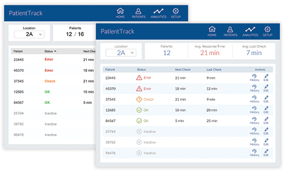
Branding color applied to the chrome and data elements of the UI (front) gives a cohesive and fully branded feel to the UI, while branding color applied only to the chrome of the UI (back) feels more generic and lacks identity.
Tone of voice
The style of communication in an interface can greatly affect perception. For the brand traits you are trying to embody, ensure that the tone of voice used throughout the content in the interface comes off as an authentic embodiment of your brand’s promise. Authenticity helps to build trust with users. Also ensure that the tone used is conducive to the user’s task at hand. For instance, a friendly, approachable tone should still be clear and succinct in communicating instructions. The use of tone is not limited to larger chunks of text; it should carry through to short blocks of text and labels like success messages, status indicators, navigation, and even alternative text descriptions that may be hidden from the visual interface but used by screen readers for vision impaired users.
For error messages or alarms that appear when users are feeling stressed or frustrated, ensure that the tone of voice does not distract from the message. Provide solutions or next steps for resolving errors when possible, and avoid using language that will cause the user more stress or frustration.

This example of tone of voice guidelines for user prompts defines the tone to use and provides examples.
Here are a few more suggestions to keep in mind while incorporating branding into the UI:
- Understand the branding guidelines, and bend or break when needed. If you are unfamiliar with the brand guidelines at the start of a project, do some research. How did the authors account for the color palette’s use on screen? Are there separate guidelines for task-based applications versus informational guides? Sometimes you may find that these things haven’t been accounted for, and you may need to create new guidelines or defy existing ones to ensure that your interface provides a good experience for users.
- Defer to content over branding. Elements that only display brand assets like a logo or a color swath may be fine for marketing materials, but it is best to prioritize task functional elements over branding elements and incorporate branding more subtly, such as through typography, layout, and color scheme.
- Consider platform UI patterns. Ensure that branding and layout patterns don’t conflict with standard UI patterns for the platform on which they will be built. Take advantage of user’s familiarity with certain platform patterns, and don’t let branding make them unrecognizable. For example, if you are developing an iPhone app, stick to the iOS human interface guidelines so that users will automatically have some familiarity with the elements in your app.
- Perform usability testing with your designs. In the medical realm, usability evaluations are required to ensure safe use, but they should also be used to identify areas of improvement in the overall experience. In testing, pick up on cues that your brand is coming across in the experience; look for patterns in facial expressions, body language, and verbal comments made by users throughout the test.
For your next UI design, keep these points in mind when the internal battle between branding and usability arises, and remember that both elements influence the user’s opinion of the product. Considering both of these aspects throughout the UI design and development of your medical device will create more unique, creative, and usable product experiences.