As healthcare designers, we aim to design systems that support a wide range of users and workflows. These systems might include touch-screen interfaces for complex surgical procedures, lab software for cell image analysis, and mobile apps for patient medication management. Information architecture (IA) is the foundation for the hierarchy, navigation, features, and interactions of the interfaces we build. Without IA, we would be left with a pile of content and features, with no way of understanding where to begin or how to use them.
With an understanding of end users’ goals, motivations, and current workflows and pain points, we can begin brainstorming information architecture. The following patterns can be used to begin mapping out architecture concepts. Try walking through each pattern and testing it against your user stories or workflows, or try various combinations of patterns to address different pieces of your workflows. For example, your main architecture may use the hub and spoke model, but each spoke may require a different sub-pattern based on the user goals and workflows within each section. It may help to start with an inventory of feature sets or content areas of your system that can be plugged into these IA patterns.
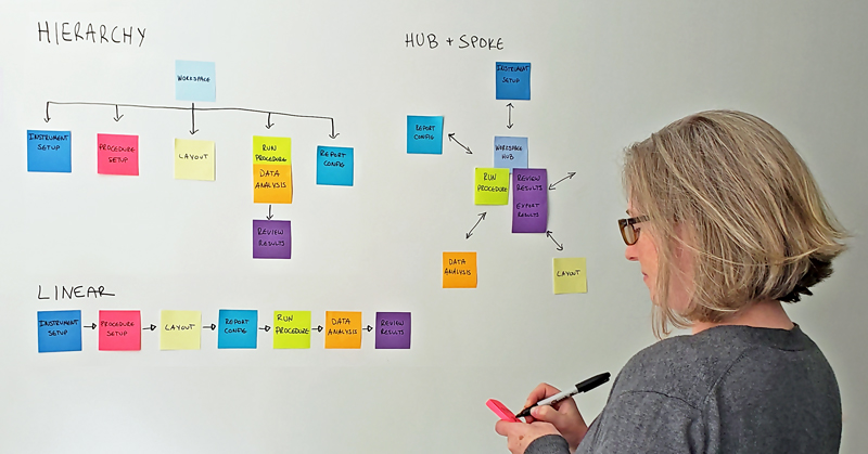
Hierarchy
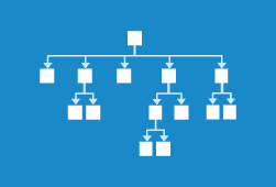 Top-down categorical tree. Users navigate top-level (parent) navigation and drill into sub-level (child) content. Hierarchy can be strict, where sub-levels can only be accessed via the direct parent, or multi-dimensional, where there are multiple ways of browsing the same content and one piece of content can appear in multiple hierarchies.
GOOD FOR: Information sets where the relationships have a logical hierarchical order.
WATCH OUT FOR: Too many sub-levels that can make the navigation seem cumbersome.
Tabs
 A common implementation of the hierarchy pattern. Tabs are a collection of sections tied together with a toolbar menu or set of tabs. Users can quickly scan the tabs or toolbars to understand content and functionality within each tab.
GOOD FOR: Multi-tasking. Tool-based apps with a similar theme.
WATCH OUT FOR: Complexity. This pattern is best suited for simple content structures.
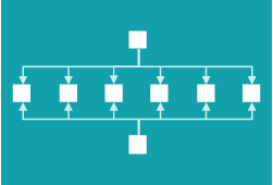
Hub & Spoke
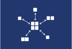 A central hub acts as the home-base for exploration. Links point outward to other sections, each siloed from the others. To move from one section to another, the user must first jump back to the hub. This is a popular choice for task-based applications that benefit from focus and minimal distraction.
GOOD FOR: Multi-functional tools, each with a distinct internal navigation and purpose.
WATCH OUT FOR:Users that want to multi-task. Users will not be able to quickly switch between sections.
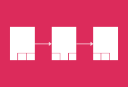
Linear
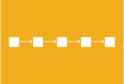 Content is structured in sequential steps. This pattern is often used to guide users through a process, for example, a setup wizard.
GOOD FOR: Workflows where the user must learn or do one thing before moving on to the next.
WATCH OUT FOR: Locking users into a structure they cannot get out of.
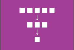
Nested Doll
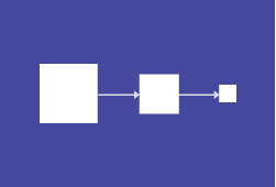 A variation of the linear pattern. Users incrementally reveal additional options as they traverse deeper into the navigation. Funneling users from broad overview to detail helps them focus on what they are looking for and narrows content within an individual section.
GOOD FOR: Singular or closely related topics. This can also be used as a sub-section pattern inside other parent patterns.
WATCH OUT FOR: Users that want to multi-task. Users will not be able to quickly switch between sections.
Bento Box
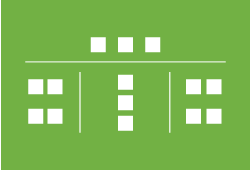 The bento box or dashboard pattern brings content or functionality directly to the main or home screen with components that display portions of related tools or content. This pattern is more suited to larger screens due to its complexity.
GOOD FOR: Multi-functional tools, data or status visualization
WATCH OUT FOR: Hierarchy can be diluted if too many items are vying for attention.
Filtered View
 A single content set can be explored from multiple aspects. Views and sorting options are controlled by the user.
GOOD FOR: Navigating large quantities of faceted content, such as medical records, test results, etc. Can be used as a sub-pattern within another navigational pattern.
WATCH OUT FOR: Filters and faceted search can be difficult to display on a smaller screen due to their complexity.
Web
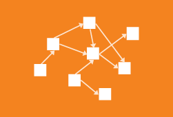 No planned structure. Content is linked together in context, like Wikipedia.
GOOD FOR: Content not known in advance, user generated content, collaborative work.
WATCH OUT FOR: Lack of structure can hinder discoverability.
Database
 A list or collection of independent chunks of content. There are relationships between content, but they are not dependent on each other.
GOOD FOR: Storing data once and displaying in many ways.
WATCH OUT FOR: Information overload. This pattern is often used as a sub-pattern within a more structured pattern, such as hierarchy.
Successful implementation of these patterns relies on using a minimal number of patterns and using them consistently for similar tasks. In doing this, users build “muscle memory” within an interface that allows them to focus on completing their tasks. It also lets the navigation serve its wayfinding purpose, rather than becoming a point of frustration.