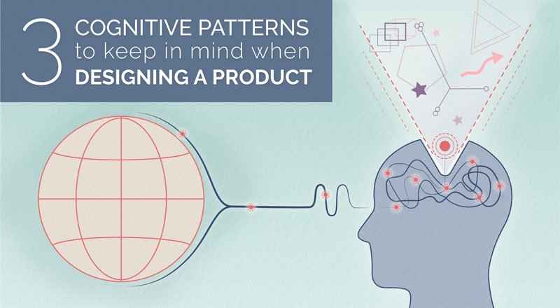
Human factors research is often described with a focus on human behavior: what is the user doing, what did they press, click, or move, and how? This doesn’t always get at the heart of an issue though. Just as important as what the user did, is why they did it. The most effective human factors research, especially when assessing risk, doesn’t focus solely on user actions. Instead, it recognizes that the user is part of a larger system. Yes, it exposes how device design and interface structure affect user behavior, but it also considers the fact that behavior may stem from the cognitive patterns and mental models that users themselves bring to the system.
Although usability testing is an important step in evaluating the design of a device or system, designers and engineers can use already-known patterns of human cognition to get a head start designing products that are less prone to use error and that work with the way our brains work, rather than against. This article is meant to provide product development teams with a brief introduction to a few psychological principles that can allow us to do just that.
1. Recognition beats recall (and working memory)
The Fact: Our brains are already working hard to get us through the day, especially in healthcare settings where there may be a large amount of activity in a small space, both physically and temporally. However, the brain’s resources are finite; the more the brain is required to pay attention to a task, the fewer resources it has left to allocate to other tasks. Such a task could include noticing an alarm or holding information in short term memory. This means that complicated products with a large number of steps and options may be more prone to use error. The average working memory capacity is 7 items +/- 2 items, so asking users to remember even up to five pieces of information could prove too taxing.
The Solution: When complexity is unavoidable, products that ask users to remember as little as possible often work best. Memory is one of the more effortful processes at our brains’ disposal. Incorporating features into an interface that prevent the user from having to recall a step or an item location freely will make for better products. Cueing participants with meaningful icons, effective drop-down menu headings, and transparent or shallow interfaces in which the organization of information is conveyed, can absolve users from having to remember the path they last took to find a certain piece of information or complete a critical step. The ways a designer chooses to require recognition (or not) by the user as he or she uses an interface can vary, and they often depend on user expertise, automaticity, workflow, etc. Still, it’s valuable to consider, and to minimize where possible, the amount of cognitive resources we ask users to employ.
2. Primacy and recency effects
The Fact: When people hear or read a list of steps or items, they tend remember the items near the beginning and end of the list better than the items closer to the middle of the list. These patterns are known as the primacy and recency effects, respectively.
The Solution: In scenarios where multiple steps or items need to be remembered to use a device correctly (e.g., a list of warnings in an IFU), consider positioning the items that are most important to be remembered near the beginning of the list. Before placing important items near the end of a list, however, consider whether users are likely to read the entire list.
3. Affordances are everywhere
The Fact: People attempt to use objects in ways that are based on affordances (the perceived ways in which a user may interact with an object, device, or system). Affordances may be communicated to a user through an object or device’s shape, texture, or other characteristics. When a product provides affordances that are consistent with the way it is intended to be manipulated by its user, we call the product intuitive or user-friendly, because we understand how to use it without having to learn. Affordances can be rooted in the way our bodies naturally interact with the physical environment, or in the way our cultures and experiences have shaped our perceptions over time. Don Norman, author of The Design of Everyday Things, one of the seminal books on usability, famously discusses the affordances of doors. Most people have tried to pull a door they should have pushed, or vice versa, and then felt a little embarrassed for doing so. Luckily for all of us, psychology suggests these mistakes aren’t ours, but are the fault of doors that convey the wrong affordances. Vertical door handles that are easy to wrap your fingers around afford a pulling motion, while flat plates or horizontal bars affixed to the face of a door afford a pushing motion. Doors that appear to afford one motion but that require a different motion from the user to work (e.g., a door with a vertical handle that must be pushed to open) are called “Norman Doors.” By understanding affordances, we are less likely to design “Norman Products.”
The Solution: Think about how you can communicate your product’s intended use through design affordances. If a heavy monitor should be lifted using two hands, provide two obvious handles on either side of its body that can be gripped while the user’s wrists are in a neutral position. If a needle cap should be pulled straight off and not twisted off, place ridges on the cap that are aligned perpendicular to the pulling motion required. The ridges are visual and tactile clues for the user who can perceive that they would only provide useful friction while pulling and not twisting. These are just two simple examples; the list of example affordances that can be used in product design goes on and on.
We’ll never be able to fully predict user behavior, so usability evaluations and validation testing to ensure safe and effective use will always be important. However, we can use our understanding of psychology and cognition to inform our designs and get a head start when it comes to designing products or medical devices that are intuitive and less prone to use error.